


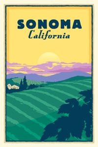
 Sonoma Looking Good
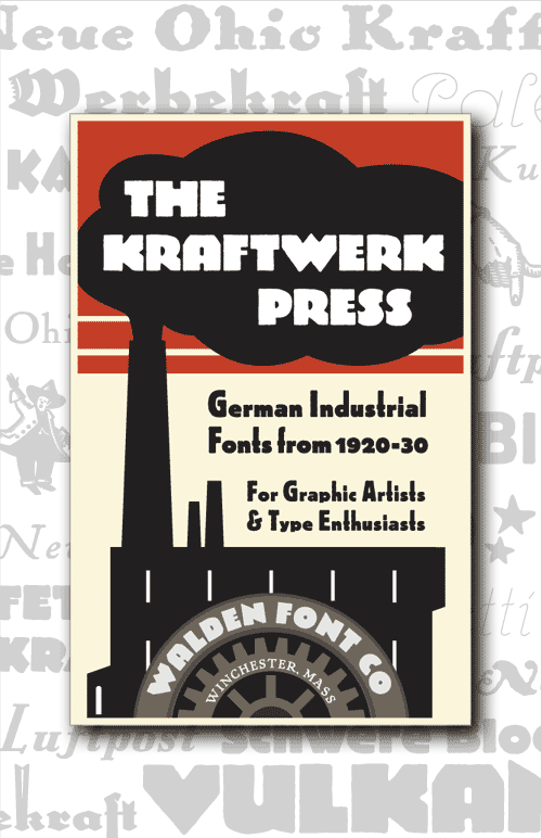
Buy This Font Set
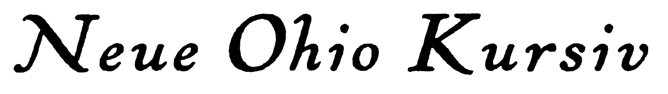
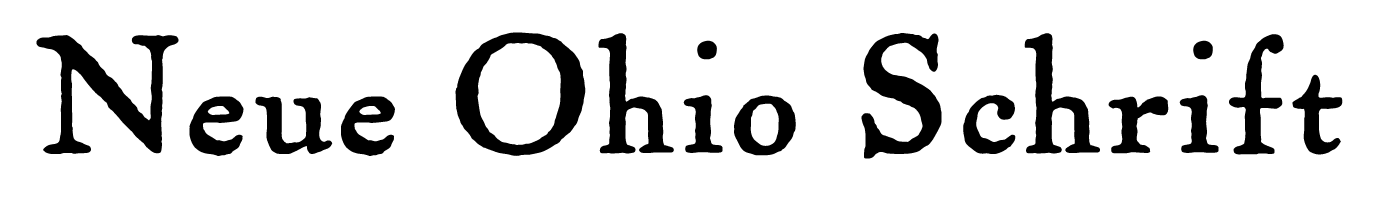
The Kraftwerk Press is a collection of revival and original German typefaces from 1920-1930. They range from gritty industrial to rustic and sophisticated. Use them in any project that needs an unusual retro look.
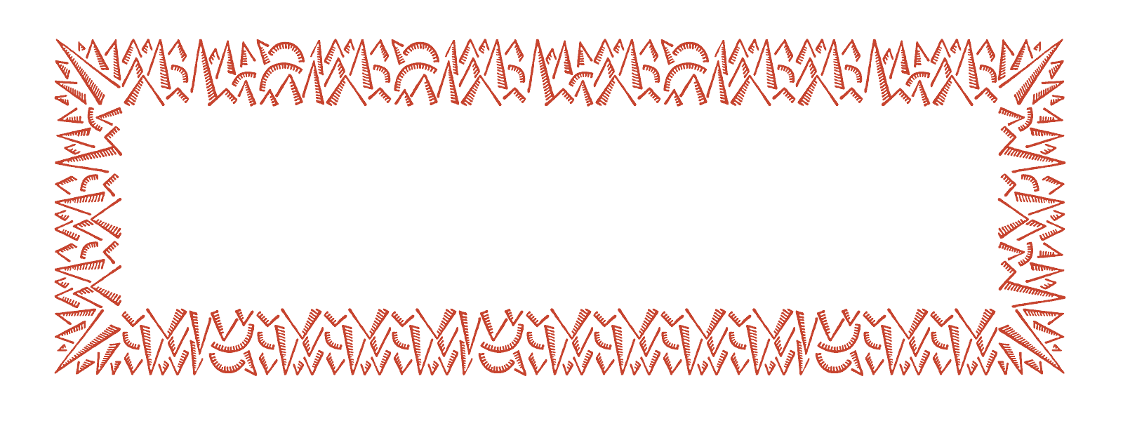
All outlines have been redrawn for improved quality; all fonts feature complete Western Latin character sets. Stylistic Sets expand the range of available characters. The symbol fonts contain a large number of useful period images.
You get:
- - 12 display and text fonts
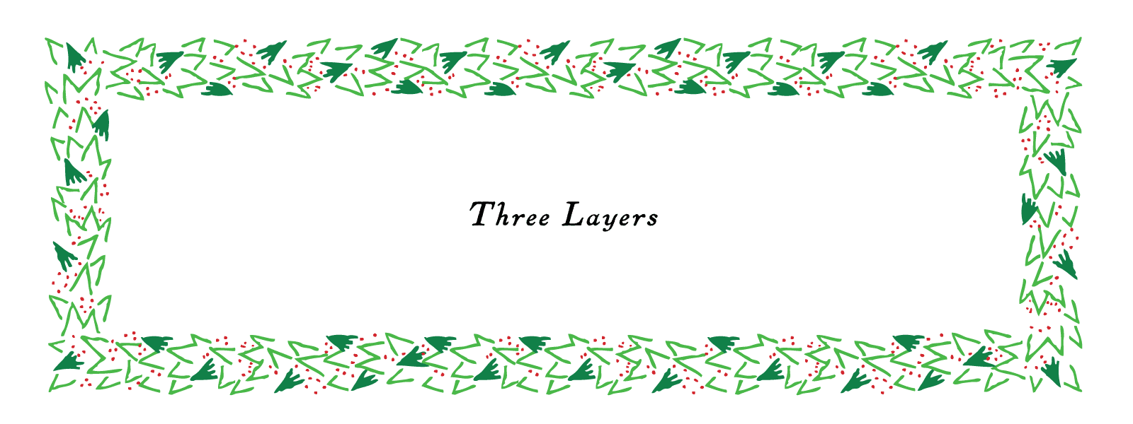
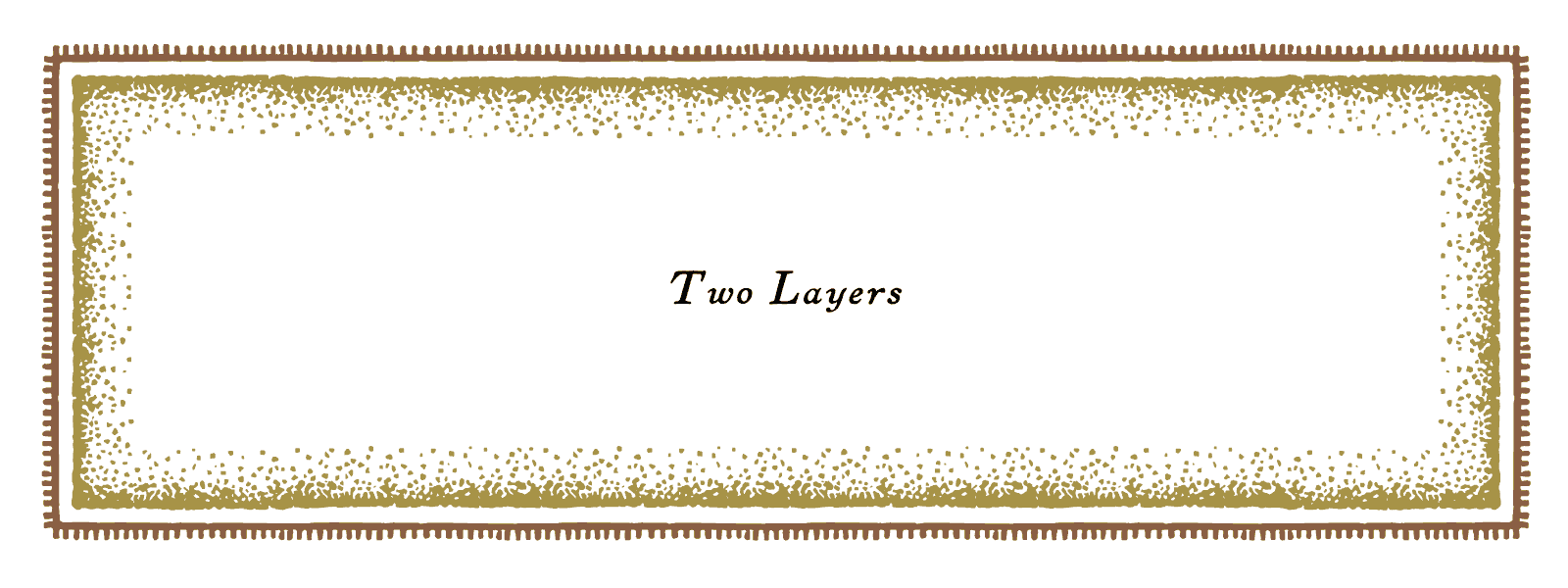
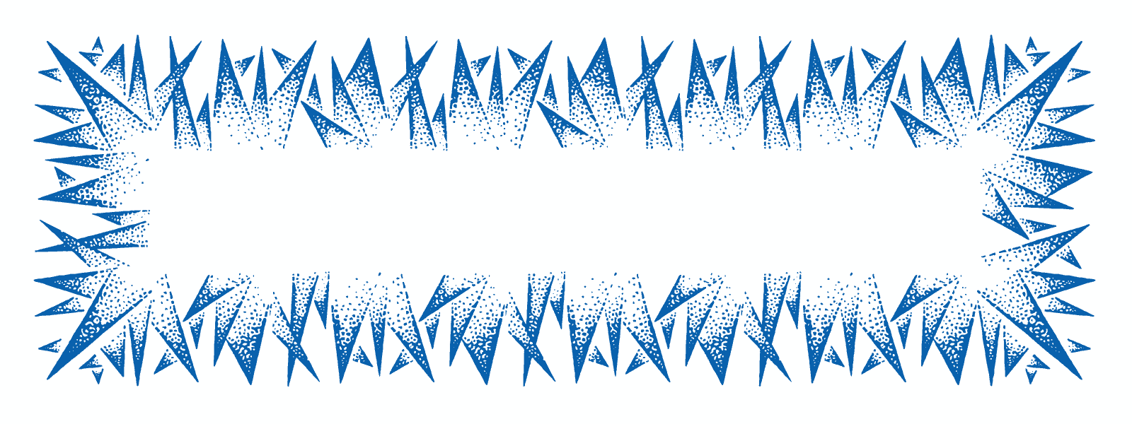
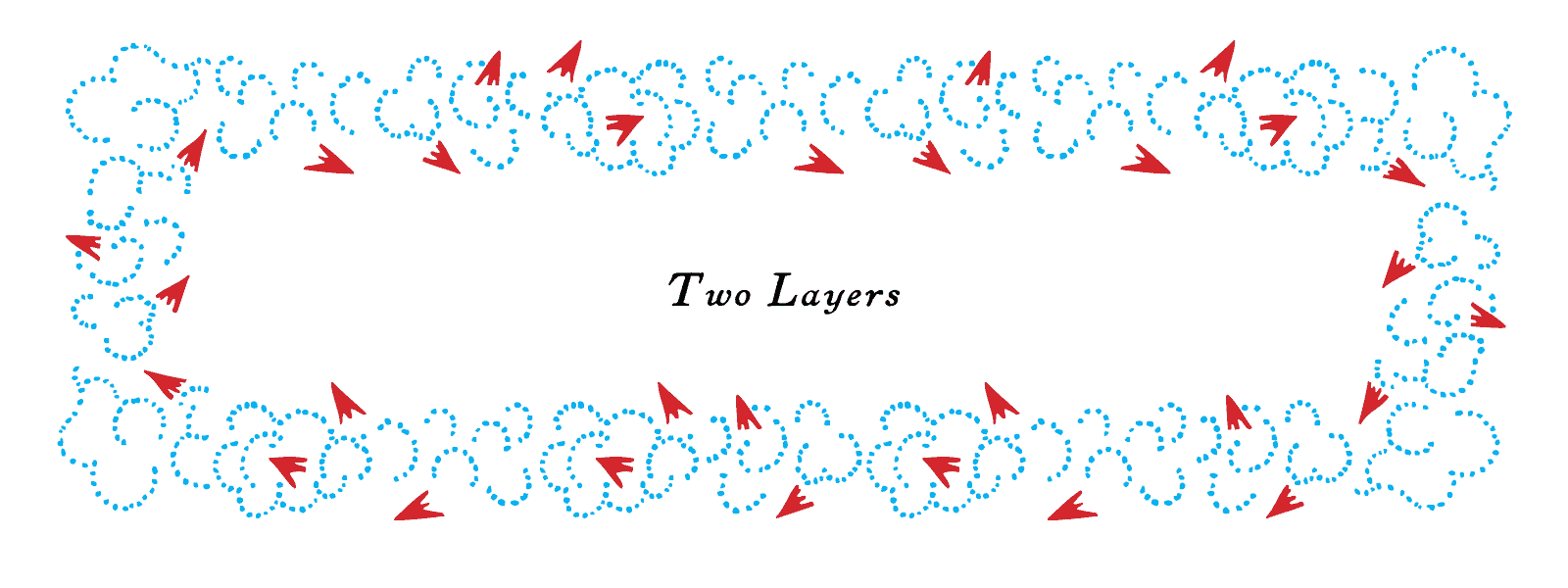
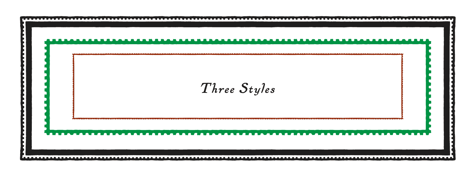
- - 10 border fonts
- - 3 ornament fonts
- - user guide
All fonts are in OpenType format, suitable for Windows and Macintosh.
Read the complete user guide here
Examples
Don’t take our word for it! Here’s a selection of projects from our Customer Gallery.
 Sonoma Looking Good
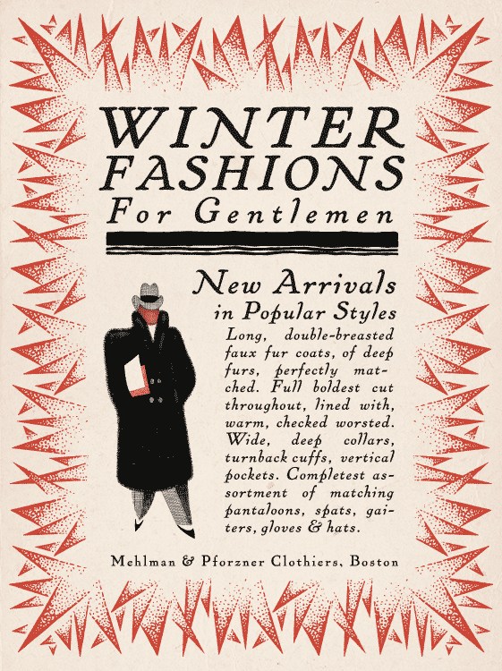
 Heavy Faces
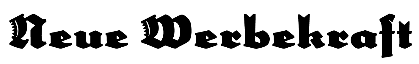
 The Modern Face of Fraktur
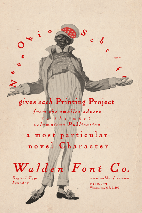
 Art Printing with Ohio Schrift
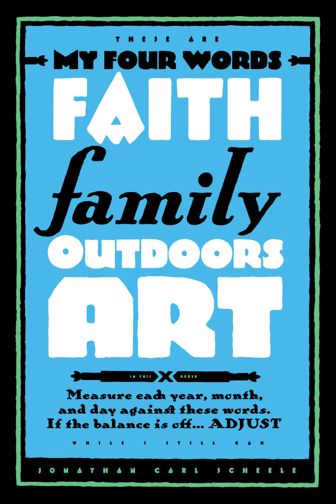
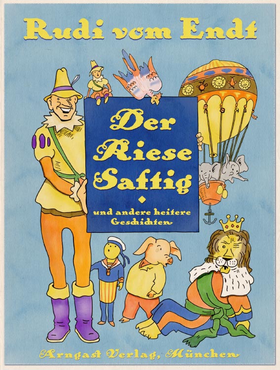
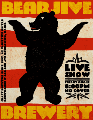 My Favorite
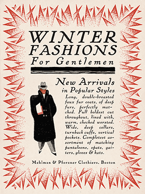 More Style for Your Message!
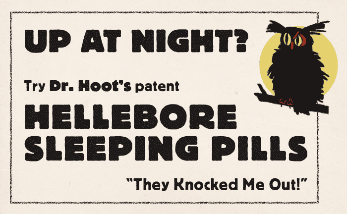
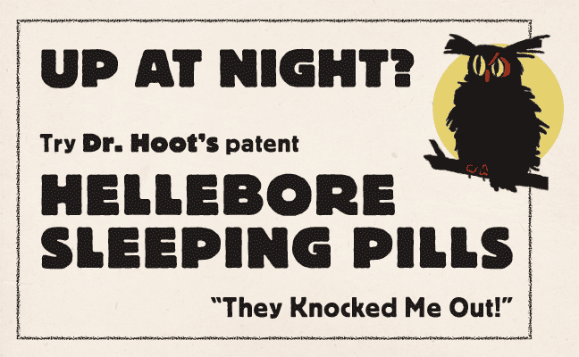 Sell more with Fettdruck
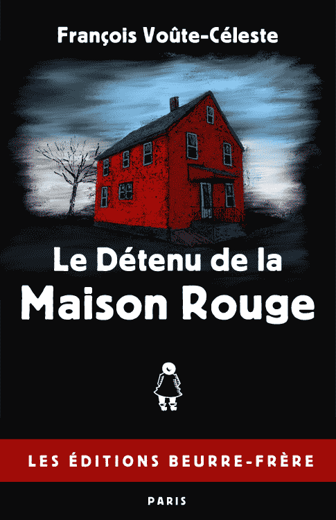
 Fictitious Fiction with Normdruck
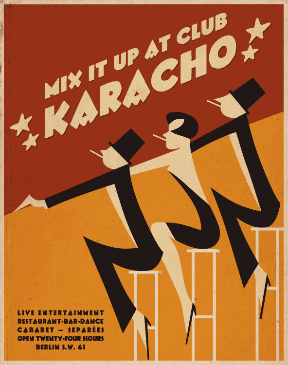
 Quicker with Karacho
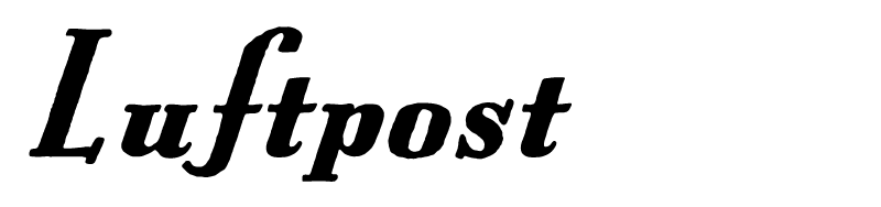
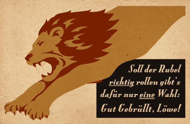 Luftpost!
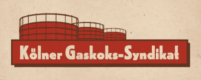 Hochdruck applied
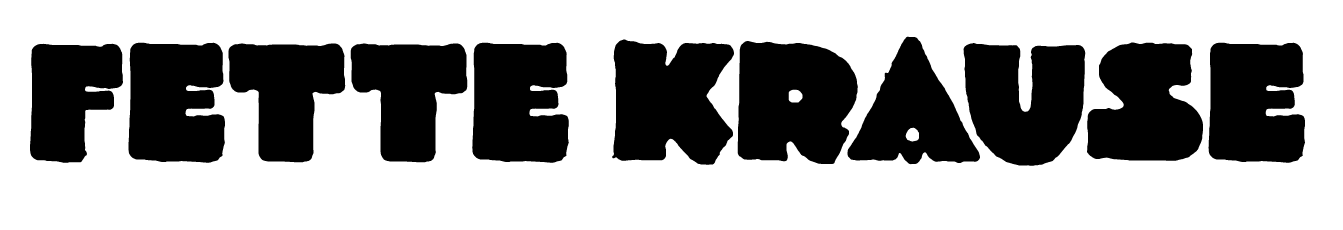
 A Modern Use for Fette Krause
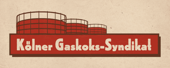
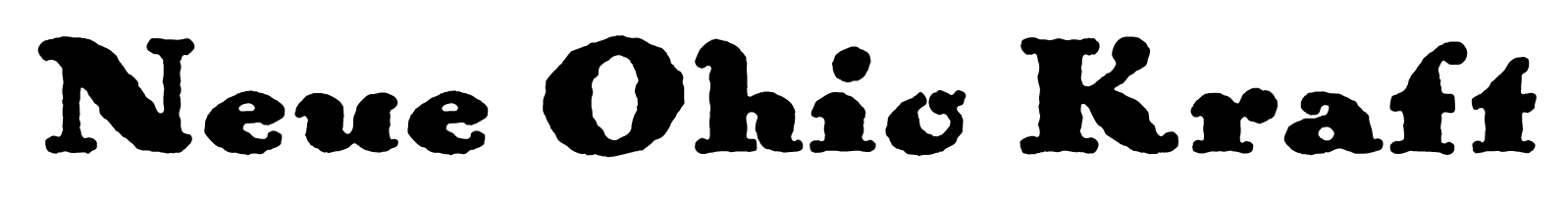
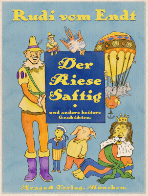 Ohio Kraft in Action