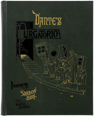
Here's a selection of projects created by our customers. Have you used our fonts in a project and want to share your work? Send an image to gallery@waldenfont.com. Please include some information about your project!
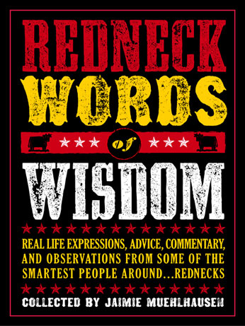
Redneck Words of Wisdom
Jaimie Muehlhausen, San Diego designer extraordinaire and creator of the Redneck Words of Wisdom website used our Wild West Press in the artwork for his eponymous book slated to by published this October by Chronicle Books.
Jaimie also used a whole bunch of our fonts on his website. Head on over when you're done here - it's a must see. I laughed so hard, I fudged my undies...
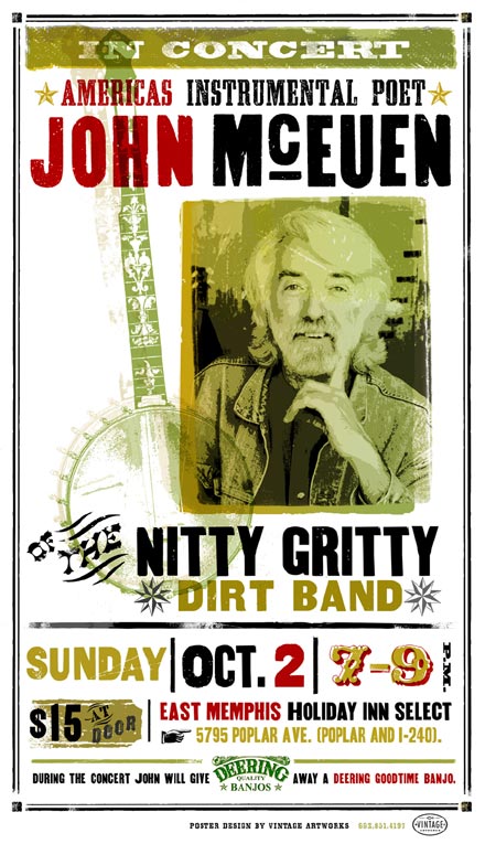
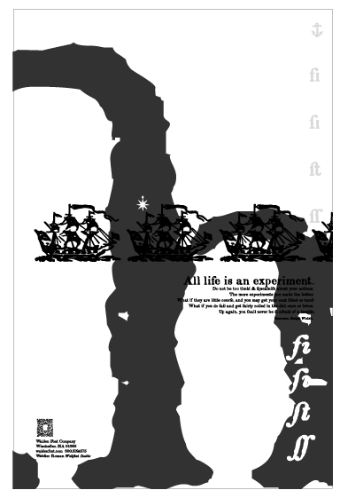
Bob Howe at Bodine.com sent us a note, along with this stunning poster:
"I love your fonts and have purchased Civil War and Wild West font sets. I am looking forward to your WW 2 set. I recently did a poster for a John McEuen of Nitty Gritty Dirt Band fame. I used some of your fonts. Thought you might like to see it. Thanks, and keep up the good work."
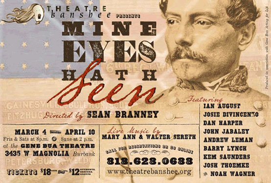
Anrew Leman, Graphic Designer par excellence
Andrew, a most amazing artist and fellow typographer, sent us this fantastic postcard. He used fonts from the Civil War Press and the Wild West Press (among others) to accomplish his design. Please visit his website at www.ahleman.com
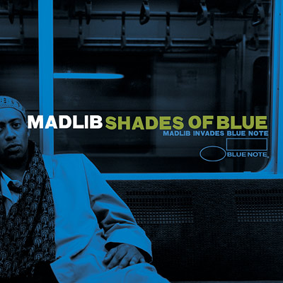
"MADLIB" Album Cover Art
Today we got this email from Jeff:
Hello. I thought I'd let you know that I used Type No. 4 on two albums for Blue Note Records, Madlib's "Shades Of Blue" and the various artists' companion piece "Untinted". The art director at Blue Note complimented this typeface when he noticed that it wasn't simple clean block letters. I do all of this artist Madlib's artwork (most of which is released on our own label Stones Throw) and I actually used Type No. 4 on several of his other records, as well as a whole bunch of the Type series on a reggae compilation/mix he did called "Blunted In The Bomb Shelter". [...] Keep up the great work!
Hello. I thought I'd let you know that I used Type No. 4 on two albums for Blue Note Records, Madlib's "Shades Of Blue" and the various artists' companion piece "Untinted". The art director at Blue Note complimented this typeface when he noticed that it wasn't simple clean block letters. I do all of this artist Madlib's artwork (most of which is released on our own label Stones Throw) and I actually used Type No. 4 on several of his other records, as well as a whole bunch of the Type series on a reggae compilation/mix he did called "Blunted In The Bomb Shelter". [...] Keep up the great work!
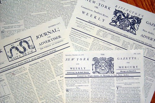
Colonial Newspapers
Scott Blake of the Pulaski Legion makes these fantastic reproduction newspapers with our Minuteman Printshop.
Check out his site at www.pulaskilegion.org/scottpapers.htm
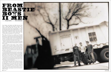
Mass Appeal Magazine No. 28
Founded in 1996, Mass Appeal is a bi-monthly urban lifestyle magazine based in Brooklyn, NY. The Art Director at Mass Appeal used fonts from our Wild West Press for a feature on the Beastie Boys and a number of other headlines throughout the issue. Find out more about Mass Appeal magazine at www.massappealmag.com.
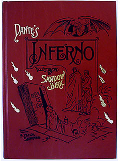
Dante's Inferno
Trillium Press is a world-famous maker of art books. Their edition of Dante's Inferno used Coelnisch Current Fraktur from our Gutenberg Press for the chapter headings. To find out more about this magnificent book, please visit Trillium Press.

